10 Tips To Make The Most Of Your School Website
Are you making the most of your website?
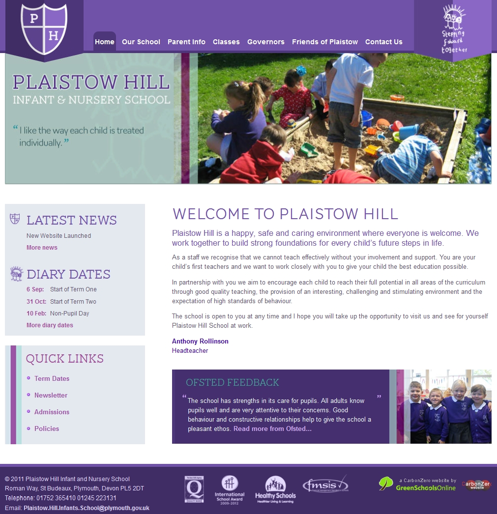
Have you taken a good hard look at your website recently?
You probably invested a lot of time, if not money, in your website. In the same way you might wash your car and have it serviced, your website will also benefit from some basic, regular maintenance.
In fact, the best school websites constantly evolve and change, just like the internet itself. They’re not a ‘print and forget’ exercise like perhaps a prospectus might be.
Here are 10 tips which will help ensure that your website remains effective:
1. Keep content up to date
If content never changes, there’s no reason for a visitor to return. That means lost opportunities to communicate. It’s essential these days that schools have a means for editing the content themselves, a CMS. It should ideally be web based to enable updates to be made quickly & easily, anytime, anywhere.
Other features such as dynamic news & diary date panels will also help make updates quick & easy. Parents love to see photos of their children, so a photo gallery feature which allows a one click bulk upload of photos will really make it easy for you to fulfil that wish.
2. Be search engine friendly
If you want prospective parents to be able to find your website, search engines need to be able to index your pages accurately. They will examine the page name, titles and content. To help them, a good CMS will have styles for headings 1, 2, 3 etc. Make sure you use these and that they properly describe the actual content. Websites with page names such as www.website.co.uk/pageid=&1432 are likely to be at a disadvantage.
Try Googling for your school as if you were a prospective parent. E.g. “Prep School Canterbury”. Do you appear? Are the details correct? Do you see a map headed “Local business results” – Add your school with a photo by registering it with Google Business Centre.
3. Take an interest in your visitors
Make sure you have detailed statistics about your visitors. Which town, which country even, did visitors come from? Which pages did they read and for how long? Are there any other websites referring visitors? Follow the link and check the details they have are accurate. What search terms are visitors using to find you?
Not only will you discover a lot about what’s important to your visitors, it’s also fascinating! Try Google Analytics as it’s terrifically powerful, easy to use and best of all, free.
4. Have a Favicon
When you visit the BBC website, you get a small ‘BBC’ image in your browser tab. Why not have the school logo? It’s very simple, but brands your window and usually gets saved alongside bookmarks.
5. Make your website easy to use & content easy to read
Usability is about enabling a visitor to quickly find what they came for and giving them a smooth experience along the way. Less is more and most visitors will not wish to read through lengthy pages. Content naturally grows over time, so it’s good to have a spring clean. Keep top level navigation down to 6-8 items and try not to have too many sub-pages.
Quirky navigation systems may be interesting but can often be counter-intuitive for parents and lead to confusion or, worse, frustration.
Ask admin staff what information parents call the school asking about the most. Ensure this information is on the website, then add quick links from the home page.
6. Personalise
It’s easy to dismiss social media such as Twitter, Facebook and Blogs as fads, but many schools are finding they offer valuable extra opportunities to reinforce the school brand and build relationships. For example, for some of our schools we have integrated a Twitter ‘feed’ to the home page “From the Head’s Desk”. Short reminders or congratulations are posted by mobile phone or the internet direct to the home page.
7. Ensure cross browser compatibility
I’m a PC. You’re a Mac. Sometimes your website will appear differently in different web browsers. As browsers evolve and new versions are issued, it’s worth checking periodically to ensure that all your visitors are having the same great experience.
8. Have an interactive prospectus
Many parents will prefer an electronic prospectus so most schools already have their brochures available as a pdf to download. Schools are now also adding interactive ‘page turning’ prospectuses to their websites.
9. Design
Websites can quickly start to look dated. If your website uses the latest Cascading Style Sheets (CSS), often a website can get a facelift with just a few hours work. Small changes to colours, photos and graphics can have a big impact.
10. Appoint a website champion
Having an enthusiastic person co-ordinating the website is key to maintaining its’ momentum. Fully supported and trained, they will be able to act on feedback, develop or delegate content and ensure that the school website continues to meet the schools needs.
Finally, just take a look at your school website from time to time!
We’d love to hear from you if you have your own tips to share.
This article originally appeared in Private Schools magazine.


