Latest School Website Designs: May 2017
We’ve had some amazing school websites launch this month, in all shapes and sizes. Lots of beautiful variety, and a few new tricks too! Let’s have a closer look at some of the highlights of the first latest school website launch on our list this month:
Burntwood School
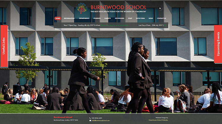
A school’s website is often the first place prospective parents and staff look when deciding on the future of their child or career. Even if they are simply looking for information, a highly valuable first impression is being made. As a result, the school website is a great opportunity to position a school’s strongest assets. High quality newsletter? A space to download the latest edition is a great idea. An Ofsted quote to be very proud of? The homepage is a great place to tastefully place this. In October 2015, Burntwood School, in Wandsworth won the RIBA Stirling Prize, the UK’s leading architecture award. It was covered by the BBC. As a result, we have an elegant and minimalist design that provided maximum screen space to fantastic shots of the building. Like the architecture itself, the design elements are modern, crisp, and clean. Important information for current attendees and staff are neatly tucked into slide out panels. We don’t often recommend scrolling tickers where they are not needed (they can be distracting and offer potential accessibility issues) but here, the scrolling ticker is put to great use, saving space in order to display the building for a very impressive website.
Hurst Primary School
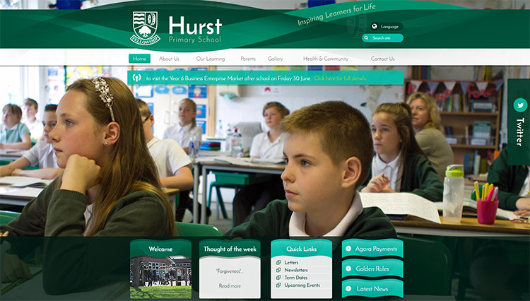
Hurst Primary School in Bexley, are lucky in a couple of ways when it comes to their school website; They have a great shade of green to work with, and they have a staff member able to write great content. The former, is helped even more by the fact they are next to the River Cray, resulting in water themes in their branding. Elegant, natural green curves make this website very easy on the eye. The latter takes pride of place in the “Thought of the week” noticeboard. Having a panel of this kind, like news, events, diary or similar can be a challenge if there is no dedicated staff member to look after it. A school website can look a little neglected if the last post was over a year ago, or has said the same thing for months on end. Luckily, Hurst take their thought of the week seriously, and their beautiful website is all the better for it. Our unique social wall is accessible on the right, which benefits from frequent activity. We’ve made it easy for Hurst to engage parents and share their ethos.
Latest School Website – Rosebank Primary School
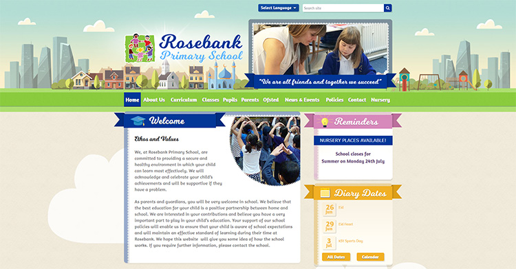
One of the benefits of illustrations is that they allow you to convey some ideas and messages that photographs cannot. An illustrated skyline is a great example – you can group together buildings and landmarks that define a whole town or city.
Ladybird Nursery School
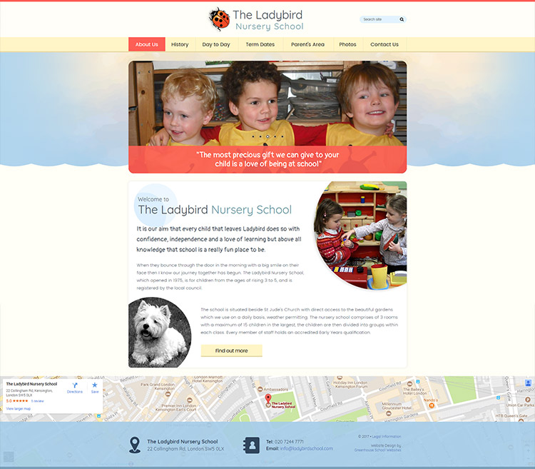
When it comes to cute animals, we know our stuff. So when we first spoke to The Ladybird Nursery School we were delighted they wanted to feature Merlin, their dog. Fanny Ward, their headmistress has been at the school for over forty years. There’s a strong sense of wholesome child care, so the rounded corners and pastel colours give that sense of almost maternal attention. The site is smartphone friendly too, which given the age group of the children, make it even more likely that the site’s visitors will be younger and more likely to be visiting the site from a mobile device. That said, we feel that every school website should be smartphone friendly.
Latest School Website – St Paul’s C of E (VC) Junior School
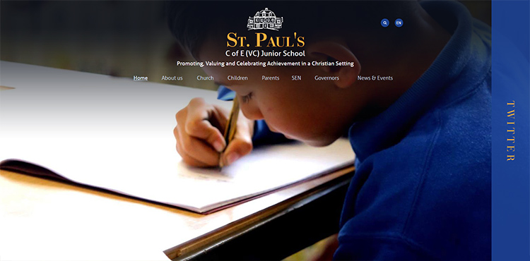
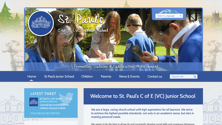
After some time (usually a couple of years), most schools we work with approach us to give their site a fresh design and completely new look to reflect changes in ethos, branding, or preference. All you need to do is let us know and we get the ball rolling for you. St Paul’s did just that. Below, you’ll see a screenshot of their old site, that we created for them some years ago. It’s still a good design, but after re-branding, their website needed to reflect their more modern direction. The new website features our fantastic social wall, and of course, beautiful full page photos.
Here is the site as seen previously:
