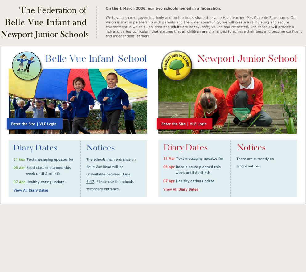
What makes a good school website?
It’s a question we get asked quite often. We like to think that all of our websites are ‘good’, but we recognise that it’s a subjective term.
However, there are some simple guidelines that apply to every website:
1. Great design – the design positions the school. A clear interface helps parents use the site (assuming that’s the primary audience)
2. Good, targeted content – well written content that’s clearly signposted and if it can be broken down into digestible chunks, so much the better
3. Regularly updated – recent news items, school calendars, image galleries etc.
Things to avoid include:
- too much content, especially on the home page
- not enough photos (they’re great for adding interest to a page)
- launching a site then never updating it
- ‘over-design’ i.e. something that’s so involved it becomes very difficult to update, detracts from the content and dates very quickly.
You can read more about this topic on this blog post at Education Executive.


