What makes a great school website?

We would, with more than a little bias, say that all of our school websites are great. Perhaps even fantastic, if we may be so bold? In this blog, however, we would like to take a more objective look at what it is in general which makes for a great school website – one which keeps your parents, students, and local community coming back to find all the information they need. One which is easy to navigate and a pleasure, not a chore, to use.
Eye-catching photography
One thing is certain with this website for Chadwell Heath Academy – you are going to stop for a moment just to take this photo in! Not every photo has to be this spectacular but it helps if one or two full-sized photos on the homepage have these breathtaking appeal. In a sea of school websites your own website would at the very least stand out to prospective parents!

Funny or heartwarming photos
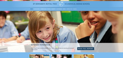
The photo below from Claverdon Primary School is not as dramatic as the photo above but it is all about photography again. This time the focus is photos which warm the heart of prospective, and current, parents. Photography which conveys the warmth of a school and also shows that achievement is the academic goal but that some light-hearted fun is also involved and children will grow as rounded humans with a sense of humour.

Testimonials
Having some quotes from parents or even children, as at Earls Colne Primary School, can be a great way to enhance your school website. We like websites to work smoothly and sometimes they often have an almost corporate feel so that they are easy to navigate, but that doesn’t mean removing the little touches which make it unmistakably a great school website.

Easy to find information
Having clear ways to find information can make all the difference for parents and students coming to your website. This layout of the latest news and diary dates is just one of many, many designs our designers come up with – however nice they look though, the most important thing is that they are easy to find and easy to read.

Include your values and ethos with great school website design
You need to include some values or ethos statements as part of the statutory school website requirements for Ofsted. But beyond that this is really key information for prospective parents too. The design below also shows how you can have fun and make your values a really stunning part of your website design rather than just typing up some paragraphs or attaching a policy which many parents (sorry!) will never read through.

Some added extras
If you need your school website to stand out from the crowd then some added extras, such as a virtual tour or drone footage of the grounds, can make a real difference. For prospective parents this will give them a feeling that they already know the school setting before they set foot through the doors – which means on an Open Day they already feel at home.

Having seen these websites you might be interested in more information from Greenhouse School Websites:


