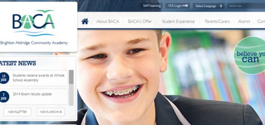
How to have a terrible school website
Or, How to Annoy Parents and Alienate Ofsted.
There’s plenty of advice out there on how to have a great school website; we’ve written lots of articles in the past about website design, content ideas, and showing off the information that parents and Ofsted want to see. But let’s imagine you want to have the worst school website ever; here is our ultimate guide on how to make your school website terrible.
Don’t download and use our Ofsted Checklist
We offer a free Ofsted Statutory Requirements Checklist, which is an invaluable resource! However, if you are trying to make your school website as terrible as possible, downloading and using the checklist is a bad idea. This is a risky course of action, as Ofsted take the information available on a school website into consideration during an inspection.

Don’t read these content tips and tricks articles
- 5 things to update on your school website before summer
- Featuring your school curriculum for Ofsted
- Update these 12 statutory items on your school website now
- 5 ways to make your parents love your school website
Ignore GDPR regulations
GDPR can be confusing at the best of times, but one key point is that personal data (including photos) should be kept no longer than is necessary. Keeping photos of students who are no longer at the school up on the website is an efficient way of both contributing to a terrible website, and flouting GDPR at once.
(Tes have a great article on how schools can become GDPR compliant here)
Leave out of date information on the homepage
Out of date and inaccurate information is a nuisance to parents, and takes all forms. We have seen school closed notices that are months out of date, snow warnings still published in August, and websites that name the wrong headteacher throughout the website.
Use Low-Quality Photos
If there are any images on the homepage of your website, you need to check that they are as low quality as possible. In order to make it look truly awful, you need to use pixelated photographs that could easily be mistaken for a screenshot of Minecraft. However, in a pinch, blurry, grainy, out of focus or stretched and distorted photos will also give your website a slightly sad look.
Build a confusing menu system
If parents can’t find the information they need on the website quickly and easily, they will give up looking. Often they will phone the school directly instead to get the answer. This is inconvenient for school office staff, who already have enough work to be getting on with. To maximise the misery of parents and staff alike, make popular pages inaccessible or hard to find. Either make sure that they are not on the menu at all, or hide the pages under illogical menu systems. Rename pages to obscure titles; stating the obvious is for the weak, who want to have a nice website with good accessibility. Using slang or abbreviations that parents are unlikely to understand is another hot tip.
Don’t take training
Learning new skills and a terrible school website are like oil and water; they don’t mix well. The more you know about editing the school website, the harder it is to keep a website looking rubbish.
Don’t get in touch with Support
If you are editing the website and something ends up looking not quite right, resist the temptation to email support… they would help to fix the issue! If you don’t know how to use a particular function on the school website, such as autolists, photo galleries, embedded videos, or news and diary dates, then just give up. Phoning our support team would lead to you being talked through the process step-by-step, and the next thing you know, your school website might look good!
Don’t update the school website at all… for years at a time
The easiest (but not the quickest) way to develop a terrible school website is to never update it, ever. Ignore the temptation to post upcoming diary dates or news items about recent events. Don’t update policies, statutory information or any information that a parent or prospective parent may need.
How to stop having a terrible school website
We feel that the best way to stop having a terrible school website is to get Greenhouse to build you a new one! Whilst it is very easy to end up with a terrible website, and a bit more work to have a great school website, we try to take as much pain out of the process as possible.
How Greenhouse School Websites can help
- Unlimited Support via phone and email
- Annual refresher training
- Free Ofsted Checklist
- An intuitive and easy to use CMS designed to meet the needs of schools
- 50 pages of content transfer with a new bespoke website
- Time-saving features such as autolists
- Great photography services
- Handy App to help parents stay informed


