10 Ideas for an effective school website home page
Updated March 2023
Your home page is the most important page of your school website. We know from our analytics that the home page on a school website is the most viewed page. It’s possible that some people only ever see that one page, so you should really spend a lot of time and effort thinking about how to best make use of your website home page. For prospective parents, it should be immediately obvious from the home page what is unique and special about your school. Your school website home page needs to serve a diverse variety of audiences from current parents, prospective parents, staff, prospective staff, pupils, and anyone from the wider community with an interest in the school. As well as the homepage being engaging, it will help visitors to your website find other information from your website by helping to easily direct them elsewhere across the site.
1. Add the School Name and Logo
It seems obvious but make sure your school name is displayed prominently on the school website home page. Often your school name is displayed alongside the school logo.

But you can be more creative with animations and stylised versions of your logo.

Where your logo sits on the page can vary depending on your design. You might prefer it to sit top left, for example, or centrally, or bottom right as people look at the first screen. Bear in mind that your layout may alter on mobile devices, and many parents now view your website through their mobile phone, which may change where you want your logo for the mobile view of the website.

2. Position your school with a description or strap line
If it’s not obvious from your school name what type of school you are, or your phase, qualify your name prominently on your school website home page.

Perhaps you have a specialism that needs highlighting?

Or a strong ethos which you can incorporate alongside your school name and logo or separately within the homepage.

Or perhaps a strap line which tells us more about your focus.

And you may also want to add extra words which are important to your school values. Animation, colour choices and font styles can all help to highlight this information in ways which grab attention.

3. Use great photography
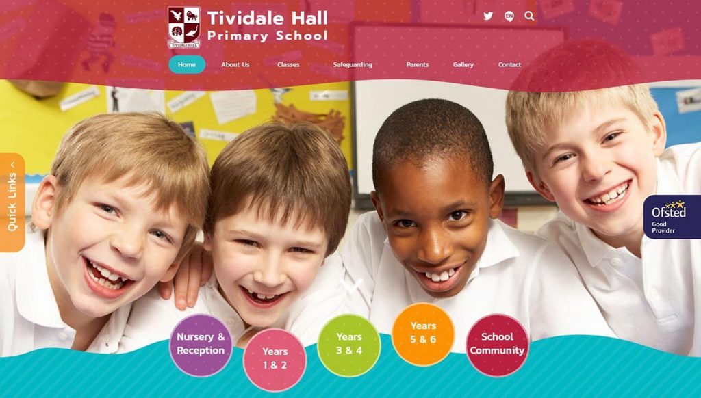
Happy children doing interesting things. There’s no more powerful way to portray your school. Professional photography definitely helps, and allows you the opportunity to let the pictures do some of the talking. Full background photos look fantastic on a school website home page.

Or an alternate could be a large feature gallery.

If you do not have high resolution photos, you might not notice if the images are smaller.

And if you do not want actual children from your school featured on your website you could have an animated background and graphics and still show what a day in your school is like, albeit in a different way.

In addition to photos and videos on your website you can also add a number of virtual tour elements, where prospective parents and students can take a guided tour of your school online. You could also add interactive campus maps to help them to navigate your real-life school buildings too.

4. Add a strong Welcome
A strong welcome from the head on the school website home page will really help introduce the school and its strengths – and a photo adds a personal touch. If you wish to be easier to find in google, don’t forget to include some keywords here.

You can also add quotes alongside your welcome message – from parents, pupils, or other staff members – to add an extra dimension.

You could also add a whole section for a gallery of quotes from all the happy members of your community! Everybody loves to hear from different voices to help them make a decision about whether yours is the right school for them, so give them lots of different examples of what makes you special.

5. Latest News and Events
News & events are most commonly aimed at current parents, but it’s worth remembering that prospective parents and other visitors can get a good flavour of the sorts of interesting things which happen day to day in your school, not to mention your successes. So don’t include too many news items about parking on your school website home page! Open days and other events for prospective parents can also be included here.

And if you have the resources, why not add interest to your news items with a little photo?

6. Guide your school website audience
If you’re particularly looking to capture the interest of prospective parents, then why not use some of the school websites’ home page to allow them to easily find what they need. This might take the form of some nicely designed buttons or feature panels.

Or the superb facilities or results which you’d particularly like them to take note of.

You could also point them towards your class learning pages.

Or curriculum information via our curriculum pop-ups.

7. Make navigation easy
The worst thing you can do is frustrate your visitors with quirky navigation or hiding content in non intuitive places. A well thought out and logical structure will help, along with adherence to standard navigation conventions. You can always help your visitors though by the use of quick links on your school website home page. These can be targeted at a mix of current & prospective parents or staff.

Or you might consider a ‘super nav’ for current parents & staff which shows at the top of every page.

8. Video
If you have one, a video clip can really introduce the school. Background videos have become very popular and will autoplay on your homepage whenever anyone visits.

Alternatively, you could embed a video onto the school website home page so that visitors can play it on their first visit.

9. Integrate social media feeds
A Twitter feed is not just a great way to keep interested ‘followers’ updated about the school. It’s also an easy way to update the school website home page from your phone. Facebook and Instagram feeds could also be used.

Facebook and Instagram feeds could also be used. And you could choose to add links to your social media feeds from your top bar also.

10. Other Ideas
A nicely designed ‘noticeboard’ is useful for highlighting news or making important announcements stand out on the school website home page.

You could also use seasonal effects which will give your homepage and interesting animated element which links to special days, events, and times of the year. We have a whole range for you to choose from and you can set them up to come on for specific time periods.

You can also use a homepage pop out window to highlight important notices at specific times of the year, and include links too where needed.

In fact, there’s no end of ways to ensure your school website home page is engaging and informative. For more inspiration please visit our huge, searchable portfolio of school website designs.
And as for the design itself…the sky’s the limit!


