Our Favourite Primary School Websites
As there are so many primary school websites we’ve designed that we love, it’s hard to choose our favourites. But here are some that are particularly memorable.
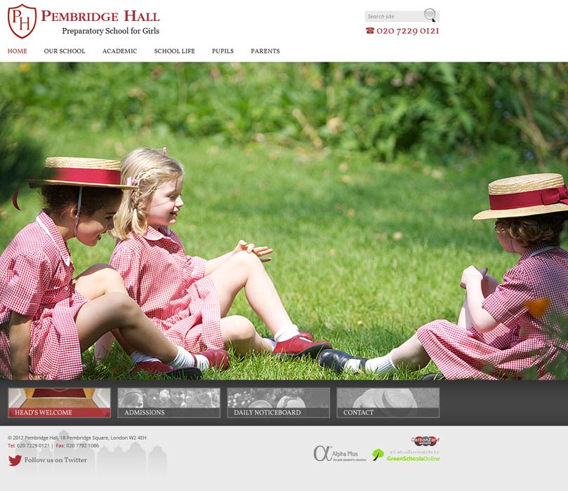
Pembridge Hall School for Girls
We love the full screen photos used on Pembridge Hall’s website- there is minimal text as the photos speak for themselves.
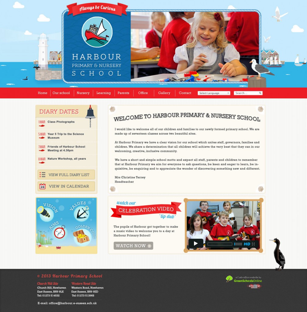
Harbour Primary School
We love the design for Harbour Primary. It strikes the perfect balance between looking clean but also fun and friendly – perfect for a primary school. We also love the bird illustrations!
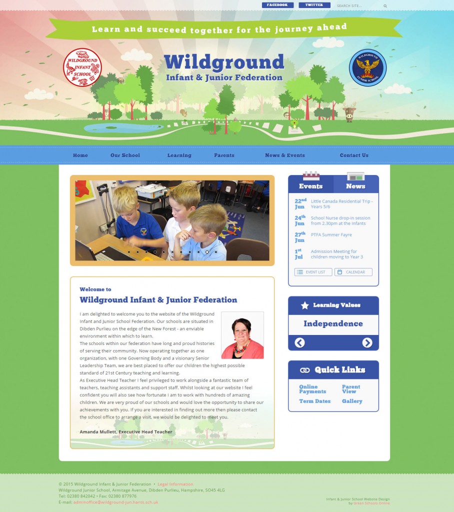
Wildground Infant & Junior Federation
Wildground’s website has a nature inspired design. We love the animated hopping frog in the banner!
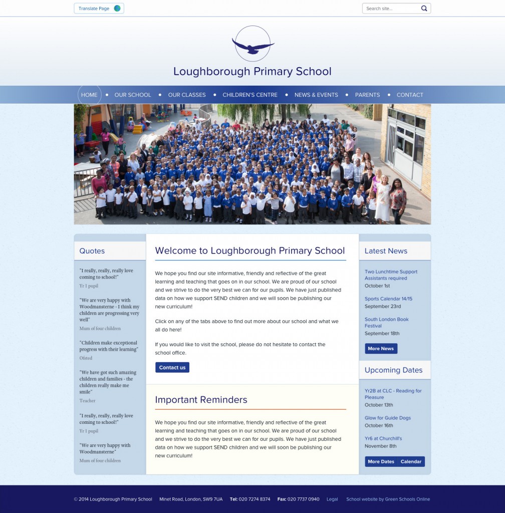
Loughborough Primary School
Loughborough Primary School have chosen a corporate style of design. We think that the layout and colour scheme looks clean and professional.
Dormers Wells Junior School
Dormers Wells have opted for a minimalist approach to their website. We think that the full screen photos really showcase the school.

