School Website Design with Illustrations
Corton Primary School Website Design Illustrations
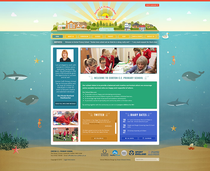
The illustrations for Corton Primary School are based on the school’s coastal location in Norfolk. We’ve included a number of marine animals, each of which represents a different class in the school. In the header of the website, a town is beautifully illustrated on an island along with the school itself. Even the menu bar is being pulled along by a duck!

Newington Community Primary Website Design
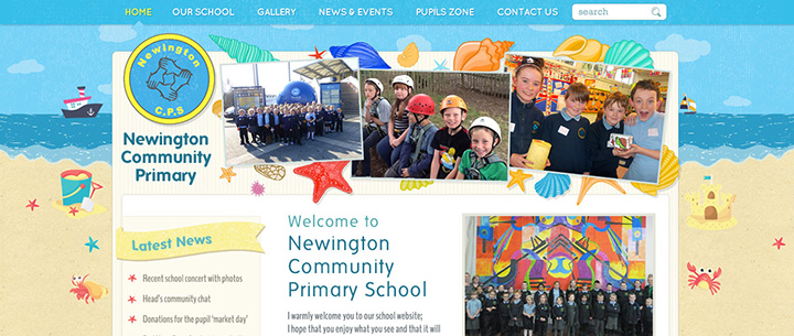
Similar to Corton, Newington is a school based near the coast in a town called Ramsgate. The illustrations on their website design include objects which relate to the shore and the beach including vibrant coloured shells, crabs, sandcastles and boats on the horizon. While exploring the home page you will also notice sections such as the Ofsted quotes and quick links keep the continuity of the illustrated background by including shells and a sand textured background.
Saltdean Primary School Website Design
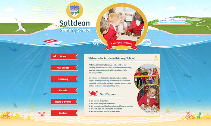
Saltdean Primary Schools illustration is a unique one as their navigation and main content layout really make way for the large illustrated background. Along the header you’ll notice the chalk cliffs across the horizon and the local lido on the right which is part of Saltdean in Brighton. We are then immersed with a simple sea and seabed illustration including various marine animals. Small icons such as seagulls, crabs, anchors and dinghys are also designed into the website to reflect the coastal town.
St Michael’s Infant School Website
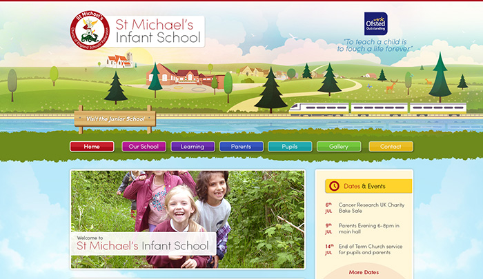
St Michael’s Infant School in Kent wanted a website design with illustrations based on their surroundings. Within the header, you’ll see the school building and its’ playground which we drew up especially with its contrasting brick and large windows against the green hills. To the left of the school is a beautifully illustrated version of the local St Michael’s church with the sun beaming behind it making it stand out.
Park Primary School Website Design

When Park Primary asked us to design their website they specifically wanted illustrations which included key local landmarks around the area of Doncaster. Looking at the illustration, on the left you’ll see the school building which we drew from photos the school supplied. Towards the centre of the illustration is St George’s Minster, which is one of Doncaster’s most architecturally important buildings with a Grade 1 listing. It plays a big role within the school and we hope our illustration does it justice! Finally, to the right, you can see another well-known landmark – Doncaster Race Course replete with horses!
Brenzett CE Primary School Website Design
Brenzett Primary has an interesting illustrated header which includes animation. The first animation you will notice is the school logo being pulled by a spitfire plane – the village used to be a base for spitfires in the war. Another animation you may notice are the windmills – these represent the wind farm which is located close to the village. The overall illustration reflects the schools’ location in the flat plains of Romney Marsh.
Is your school website overdue a new design? Get in touch!
Have you been thinking about your school’s identity? Do you feel it’s a little lost in a bland website design? We would love to apply our expertise to tease out some of your school’s core, principle strengths to shine through on a new website. It’s easy to make an initial enquiry and we can get the ball rolling with a quick chat.
Need some more inspiration?
Take a look through our extensive school website design portfolio for some ideas. Or, take a look at our illustrated websites featuring local landmarks, or some of the school website designs we launched in January 2020.

