Latest School Website Designs June 2016
The Catholic High School Website Design
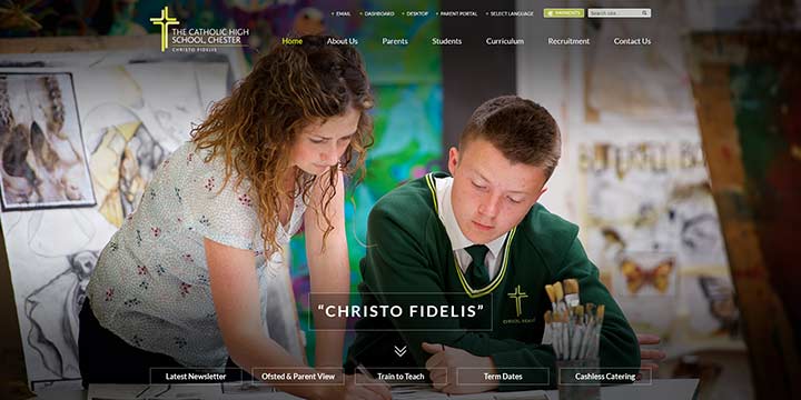
The Catholic High School in Chester school website design really stands out. A full screen image leads you down to a panelled home page with clear sections for their welcome, vision, news and diary dates. Another interesting feature are the animated graphs which highlight the schools performance statistics.
Mount Stewart Infant School Website Design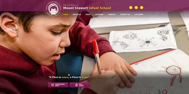
We originally designed the Mount Stewart Infant School website in 2013. They decided to take advantage of our special redesign package to give their website a more modern, fresh look. Full screen images showcase the school and clear panels are used to present key information on the home page.
Pensford Primary School Website Design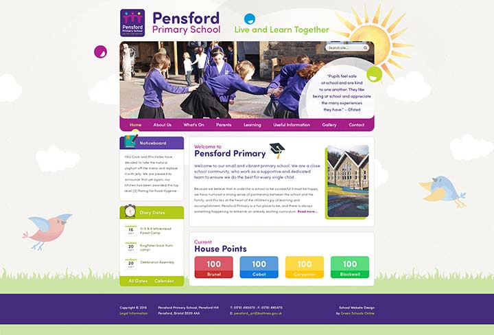
Pensford Primary School is another school whom we have worked with since 2009 that has taken advantage of our redesign service. They requested a simple child friendly website design with bright colours that work well together. Can you spot the subtle animation as you scroll down the page? At the bottom of the homepage we included a House Point area to display the current results.
Sapperton CofE Primary School Website Design
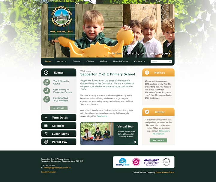
Sapperton CofE Primary is a small school based in Gloucestershire. They wanted to incorporate a subtle tartan pattern within the website design which we included as a background for the logo which works really well. Overall a simple design following the school colours with a nature feel.
Cartmel Priory CofE School Website Design
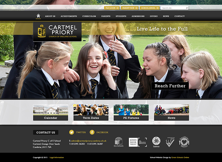
Cartmel Priory School are located in Cumbria and are relatively unusual in using black as part of their branding. Combined with gold it provides a very smart and professional look for the website design. The home page is clearly laid out with large images and clear photo link panels to direct visitors to key areas of the website. On the right there is a Facebook tab which when clicked slides out a “wall” of posts – fantastic!
Hartlepool PRU School Website Design
Hartlepool PRU is an interesting website design as it includes lots of different elements on the homepage such as school reminders, ofsted quotes, inspirational quotes and the word of the week. With the clear layout, we’ve also incorporarted more standard information into the website design such as news and events, a welcome and contact details.
Malorees Junior School Website Design
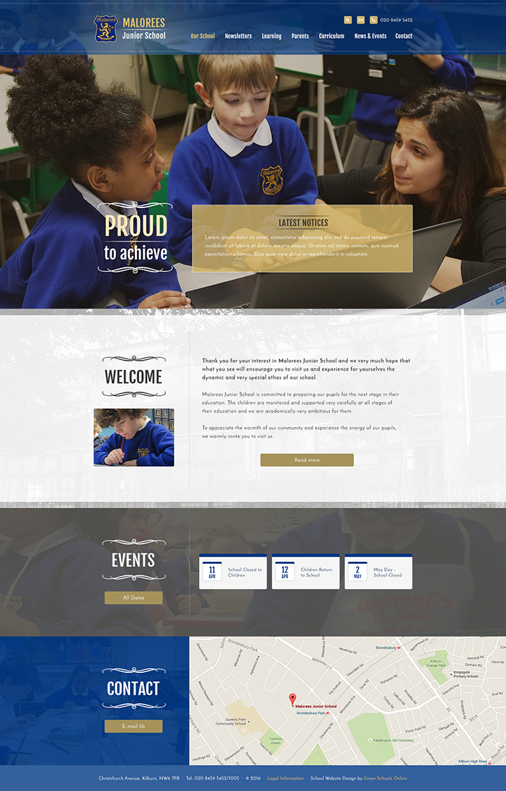
Malorees Junior School is located in West London and we have been working with them since 2012. They decided to update their website with a more modern look and we were happy to help. We really love how the blue and gold colours work together and all the small design touches – such as the use of transparent colour panels over images and elegant scrolls which really make this design stand out.
The Willink School Website Design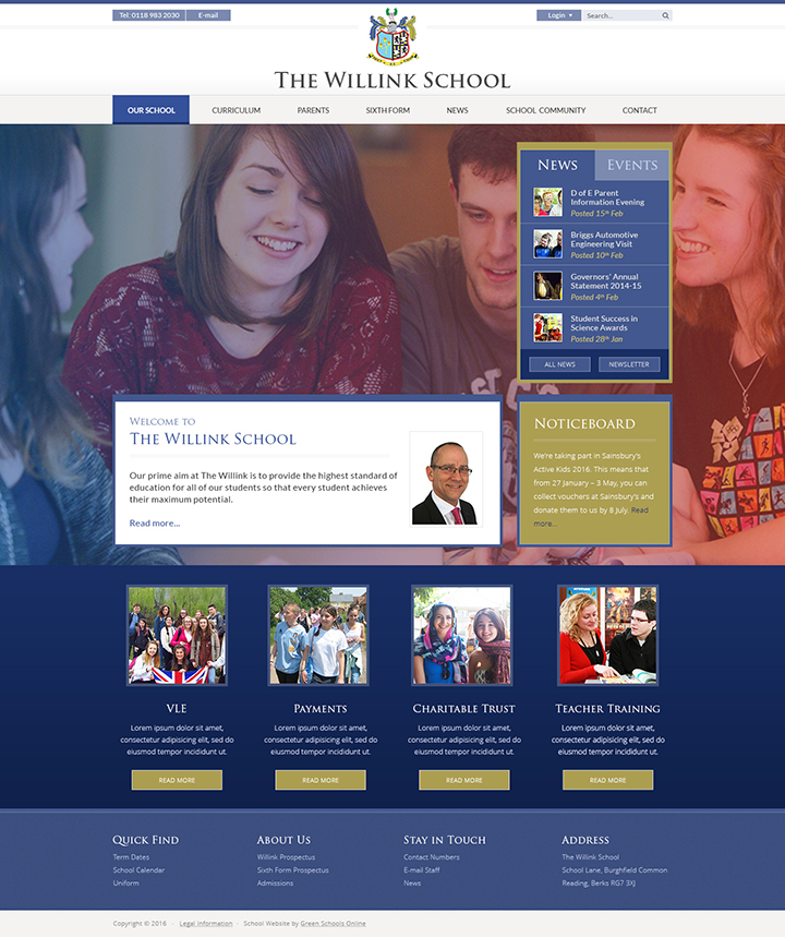
The Willink School is another re-design which had to be mentioned. Their home page design has an interesting full screen background image with an gradient overlay which goes from blue to red which really enhances the image and provides additional interest. We’ve also added in a news & diary area, a welcome plus a series of clear quick links.
You can also view our extensive portfolio of school websites searchable on our School website portfolio page. It’s even searchable by colour and type!
Other Latest School Website Design Posts
Latest school website designs March 2016
Latest school website designs December 2015

