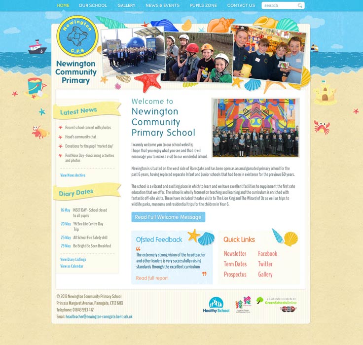
Primary School Website Design
A school website is a great place to demonstrate exactly what is special and unique about your primary school, and we believe that this should start with the design! Here we take a look at some gorgeous primary school websites designs we have launched recently.
Charlton Wood
Notably, the strapline of “Respect, Understanding, Perseverance, Pride” slowly fades into different pastel colours, a lovely touch on this website. The menu dropdowns and footer are blue to match the background of the school’s logo. The full-screen photo background has a transparent overlay with leaves displayed along the top, mirroring details from the school’s logo. On the right of the homepage, visitors can find a pop-out displaying the school’s Twitter account.

Woodingdean
Woodingdean Primary School wanted a nature-themed illustration for the background of their website, and we think that the end result is adorable! A fox can be seen in the distance on the right-hand side, and a bird flies overhead. The nature scene extends underground, with a mole and a worm tunnelling away. The homepage also features a photo gallery, the school’s motto, a welcome letter from the headteacher, and an embedded video starring staff and pupils from the school.

Slade Green Temple Grove
Slade Green Temple Grove is a part of the Haberdasher’s Aske’s group of schools, who share a group look for each of their websites. This particular primary school website design uses a mixture of colours including teal, pale grey and blue; a Twitter pop-out can be found on the right side of the website. On the left-hand side, you can see a quick links pop-out box. Under the full-screen photo background are four vibrant boxes leading to important pages. A selection of recent galleries sits below that again.
Katherines Primary Academy
Katherines Primary School is another website that shares a design with the other schools in their Trust. Other schools in the Trust have used red or green as the focus colour for the website, whilst Katherines have chosen to use blue as the main colour, to match their uniform. The design utilises the hexagons found in the school logo and Academy Trust logo throughout the website. Diary dates are displayed in animated hexagons that turn when hovered over.

South Green Junior School
South Green Junior School’s website uses a clean design centred around a full-screen photo background, which displays a selection of high quality, professionally taken photos of students. The colour scheme, which is predominantly purple and lilac with accents of yellow, matches the school uniform, tieing the website together nicely. The strapline and panel backgrounds both use lilac circles in a variety of hues. This helps the strapline to stand out from the photos behind it.

Colville Primary School
Shades of blue and red are interwoven throughout this primary school website design to create a fresh and vibrant look. The full-screen photo background on the homepage and the contact us section both have a hand-drawn border showing the buildings of Portobello road (where the school is based), giving the website a unique twist.
The welcome from the headteacher section of the homepage has a video tour of the school embedded within a circle. Little extra details help to give this primary school website design plenty of character. For instance, the buttons on the home page are animated to tilt or bulge when hovered over. Additionally, each diary date uses the globe from the school logo, which spins around once when hovered over.

Sandroyd
This gorgeous school website uses the purple of the school uniform and takes white elements from the school’s logo. A full-screen video background plays when first landing on the website, showing snippets of life at Sandroyd, mixed with sweeping drone shots of the gorgeous building, facilities and surrounding countryside. Once you click away from the home page of the website, the video is replaced by a full-screen photo of the Roman-style temple. This temple can be found in the grounds of the school and is also represented in the school logo.
The rest of the homepage uses a panelled design, alternating between a blocked purple background and photo backgrounds. Finally, a multi-feed social pop-out can be found on the right-hand side of the homepage, displaying the most recent posts from the school’s Facebook, Instagram and Twitter accounts.
Is your school website overdue a new design? Get in touch!
Have you been thinking about your school’s identity? Do you feel it’s a little lost in a bland website design? We would love to apply our expertise to tease out some of your school’s core, principle strengths to shine through on a new website. It’s easy to make an initial enquiry and we can get the ball rolling with a quick chat.
Need some more inspiration?
Take a look through our extensive Primary School website design portfolio for some ideas. Or, take a look at our top websites of 2018, or some of the school website designs we launched in March 2019.


