School Websites through the decades – (Well a decade and a half at least!)

We recently launched a redesign of a school website which we first designed in 2011 and it filled us with nostalgia so we thought we would think back and take a look at some of the trends and changes from the last 14 (and a bit!) years of working with schools to make stunning websites for them and their communities.

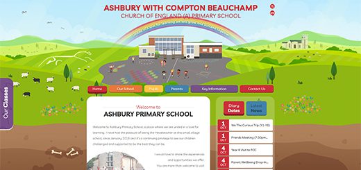
Our first school website launch was for Redland Green School in January 2008 and you can see above the image of that first design. The school is still with us, 2 re-designs later, so feel free to take a look at some of the changes on their current school website to see how trends and technology have changed over the years to allow us to make school websites even more engaging.
The growth and speed of internet connections has certainly helped along the way. Most of our current sites have widescreen images and even full screen background videos – this just would not have been viable in 2008. The websites would have just taken so long to load that any prospective parents would have disappeared before catching a glimpse!
One big trend back in 2008 which most schools wanted was a feature photo carousel using the ‘Flash’ plugin. This used to give a big ‘WOW’ moment as schools and website visitors saw a beautiful gallery or slideshow of photos from the school. The plugin would later become obsolete so this trend died off, although adding photos to the galleries, as well as the homepage, is still hugely popular. In parent surveys schools often find that current parents love to go and see the latest photos – from World Book Day, the school journey to an Outward Bound adventure week, or just the day-to-day learning and displays.
Also in 2008 and the years immediately following, CSS was a big deal and helped to add a more creative layout for websites, rather than relying on multiple nested html tables.
Moving forward to today the current trends include full-screen videos as the backdrop to websites and which auto-play on the homepage. These can really help to give prospective parents a sense of the school, the ethos, and what their child’s future day might look like. Many schools choose to also include drone footage – you’d probably have needed to hire a helicopter in 2008 for this! Perfect to feature the school grounds alongside live video footage of sports lessons, science experiments, drama productions and just photos and videos of children enjoying their learning and working hard.
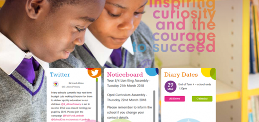
Many schools also use social media a lot more than they used to – it was pretty much unheard of for most schools in 2008! But Twitter, launched in 2006, in particular has grown in popularity with schools who share their achievements, pupil work, shared teacher resources, and information about the school and open days. We have social media walls which are added to many of our websites, whether they slide over the side when clicked or are embedded onto a page. These help schools to keep their website content fresh and updated in different ways too.
The biggest game-changer over the years has been the proliferation of mobile devices used to view websites starting with the launch of the first iPhone in 2007. Websites are now designed to display “repsonsively” according to the size of the device being used. Especially relevant for those parents and students who mostly view school websites on their phones and other mobile devices. Another improvement are web fonts which have helped to personalise and make bespoke website designs which fit perfectly with each school’s branding and logos.
What does the future of school websites look like?
We think there will be more of a shift to web apps that replace native mobile apps on mobile devices.
Also we see VR being used more and more. You can imagine the exciting potential for people to visit your website and even see inside your school without leaving the comfort of their own homes. We already provide many schools with features such as virtual tours and these would be even more interesting if you add VR so that people could be actually walking around your school and visiting classrooms via the VR headset – not in real time of course that would be a step too far! But to set up a VR tour would be amazing. We have seen that some big museums have done VR tours on their website through lockdown and hope the prices of setting these up will come down in coming years to make it something schools could offer too.
AR could be potentially exciting too, added to posters and websites where someone could hold up their phones to a certain area and get a 3D version pop up to be able to see the school facilities in 3D. The possibilities are endless!
Wherever the trends take us next, we are ready and excited to be on the journey with schools and to support schools to keep embracing the opportunities a website can provide to engage current and prospective parents and students.


