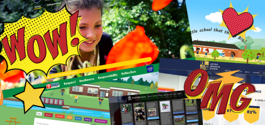
We are a school not a brand!

Most schools do not think of themselves as brands and of course as parents we are glad you don’t think of yourselves that way! But we know that schools do want to get across their identity within and beyond their local communities for a wide range of reasons and purposes.
Think about some key commercial brands you can recognise from their branding. From adverts to packaging:
- Can you recognise a certain fast food burger restaurant from their yellow arches alone? And the red background? *1
- Can you recognise a particular chocolate brand from a certain regal purple colour which shows the heritage and history of the company? *2
- How about a certain fizzy drinks manufacturer who has colour branding so distinctive and famous that they even managed to change the traditional colours for Santa to what we know it as now?! *3
What do you consider your school branding to be? Who is it for? Would people recognise it instantly?
Let’s take a school logo for example. What does it say about your school and where is it seen? On uniform, book bags, the sign outside, in recruitment adverts… the list goes on. Sometimes your logo is seen alongside others – in jobs papers, for example, or when advertising for prospective students via education magazines. Which means your logo needs to be both recognisable and unique. It should also say something about your school which helps to set you aside from other schools in the area. Perhaps you want to convey the history and prestige of your school. Maybe you want to focus on the fun children will have in their learning. Maybe you want to highlight your school building or surrounding hills by incorporating them into the design.
Whatever you want in your school logo, you may already have one that has been passed down the generations. Which makes it difficult to get a really high quality version for your website and prospectus. We help lots of schools to design logos from scratch or to make a more modern or higher quality image version of a logo they already have. This helps them to really stand out and also helps to make a logo you can be proud of when you see it embroidered onto uniforms.
Your logo is one part of your ‘brand identity’ as a school. You are not a brand in the usual commercial terms of course! But more and more schools are seeing the benefits of having consistency to the way their school is portrayed. One more modern phenomenon, especially since the pandemic started, is the need for consistency of online resources. Perhaps Powerpoint slides with the logo and certain colours on or a background design. Or brochures and learning journals or even school reports. All of these can be consistent with your brand and match with your logo and school website design well for a clean and recognisable look.
You want people to see anything to do with your school and instantly associate it with you. Whether that is someone seeing your students in their smart uniforms, or a visitor to your website, or an attendee from a training course you provided to external teachers, or an advert you placed on the side of a bus. Our ‘brand guidelines’ packages help schools with this consistency.
We also work with academy trusts who want to have branding which works across all of their schools, whilst also giving each school their unique branding so that each identity is personal. This is more complex but the principles, for us, are the same as working with individual schools. Each part of a brand package – from logo to colours used to fonts and backgrounds – is unique and personal and ‘speaks’ to the intended audience. What does it say? Well that will depend on your ethos and values.
If your logo could talk, what would it be saying? When people look at your website, what impression do they get about your school?
Get in touch to find out more about the services we can offer you to make sure you stand out from the crowd and get your message across.
*1 McDonald’s
*2 Cadbury’s
*3 Coca-Cola


